
After years of working with dashboards, we know what is important to create a good one. Each dashboard is different and specific to its own, but there are rules every report should follow to maximize the usability and bring as much business value as possible. This article will present to you most important reporting standards that are necessary to keep in mind while creating BI dashboards.
Simplicity
Main goal of the report is to provide information. Creating meaningful, easy to read visuals should be prioritized over appealing look. Of course, it is better to work with a nice report compared to ugly one but looking good should not distract from reading the data.
The best way to illustrate this is through FusionCharts in their examples of dashboard navigation errors. We recommend paying special attention to example 7 and 9, which perfectly depicts this situation.
Proper visual type
There are lots of visual types but most of reports can be created using the most popular ones – line charts, bar charts, pie charts, scatter plots, matrices and tables. Other charts should be used only in specific cases as creating complex visual, even if it provides super insightful info, may be hard to read for Users that are used to basic types.
Different visual types are best to show different insight. For example line charts show trends, clustered (side-by-side) bars show both trend and comparison, scatter plot may visualize correlation and combination chart (bars and line) may show trends and comparison/correlation of KPIs shown in different units. It is essential to know what exactly do we want to show as sometimes same chart built in different ways may focus on different insights. What can be helpful is to start from a business question that User would like to answer using given visual. Should it rather be:
- “How my sales are trending?” – line chart would be good enough, even without showing specific values as we just want to see the trend.
- “Are we selling more than last year?” – clustered column chart with one column being this year value, the other last year value for each time period.
- “Are my sales impacted by price changes? – combination chart – bars could show sales while line will visualize average price on a separate scale.
Since there are many articles and decision-making frameworks available on the Internet regarding the selection of the best visual type (such as the one published by Financial Times), the purpose of this article is not to create another one but simply to draw attention to this issue.
Normalization
All elements of the report should be normalized. For example font type and size should be the same for each element type (like page title, visual title, legend, labels etc.). There should be no more than 2 font types in the report. If red/green is used to show negative/positive, it should be the same red/green all over the report. When same category or measure is used on different visuals/pages with color differentiation, it’s color should be the same in each place it’s shown.
Normalization applies also to pages. It is much easier for Users to navigate through a report if pages are created with a template. For example, with a top pane containing logo, title, filters, etc.
Sufficiency
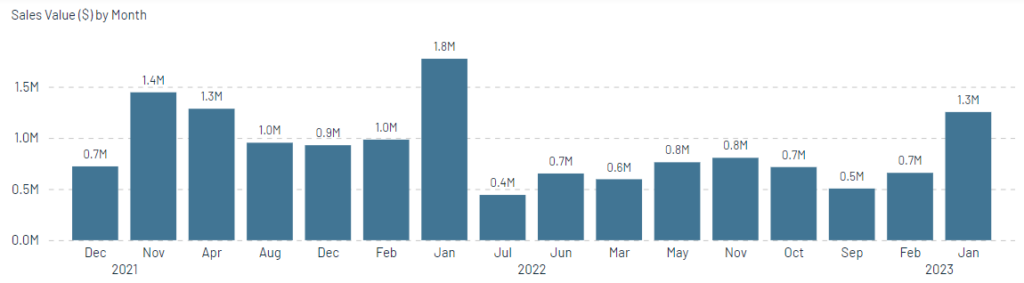
There’s no need to stress the same info more than once. For example, having bar chart showing months, it’s not ok to use different colors for each month. Exception could be showing ranked months and using gradient of a color to accent the difference from top to bottom.
Same applies to text info. If there’s a visual showing time trend of sales value, there’s no need to add title “Monthly Sales”, legend with KPI name, X-axis title as “Month” and Y-Axis title as “Sales”. These will only distract the Users from the visual itself. Having this info once is good enough.
Basic, clear and easy to read chart
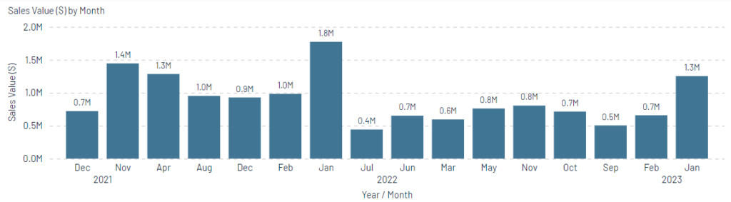
Redundant X and Y axis titles
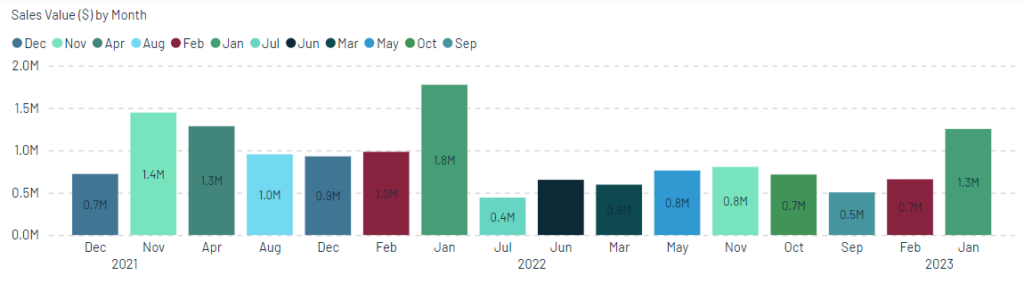
Nonintuitive and not needed coloring of categorical axis which brings no information but makes the User wonder about its meaning. The Rule 5 “Be consistent,” developed by Marco Russo and Alberto Ferrari in “15 Rules to Design a Perfect Dashboard,” relates perfectly to this.
Clarity
It is vital that Users are always sure what they are looking at. In terms of selections, KPIs and functionalities. It is worse to show values that are misleading than to show nothing. Each combination of selections in the report has to provide meaningful info or show blank with explanation why it is blank.
It has to be clear which functionalities are impacting which visuals. For example if there’s a toggle that changes KPIs on only one of four charts on the page it has to be clear which is impacted and which are not. If there’re filters that filter data for whole page, it has to be intuitive.
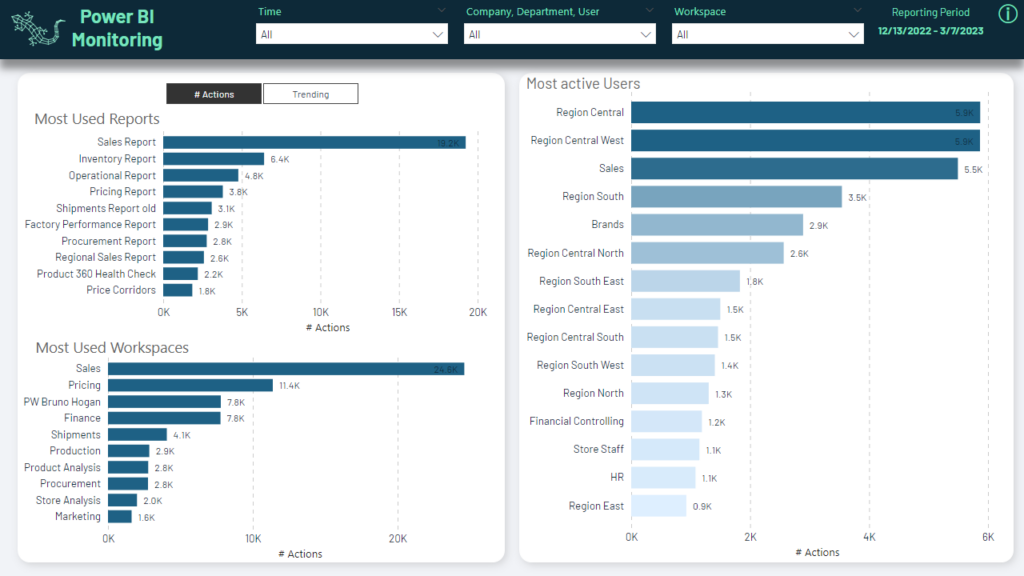
Actions/Trending toggle impacts only two left bar charts (common background) and not the right one which is on a separate background. Top filters impact all charts as they are placed at the “global” top pane.
Report should be built in a way it does not require instructions or training. Sometimes it is not possible due to complexity. In such case, help should be always available for Users. It can be in a form of KPI definition page, info icons with tooltip with additional explanations, text info directly on the page or other option that would be easy to use. The shorter the text, the higher chance it will be read.
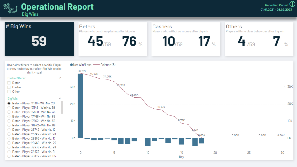
This page is not self-explanatory as shows quite complex idea. That’s why there’s help text explaining filters behaviour and info icon with details after hoovering.
Important aspect is also unit of measure for KPIs. It should be clear what is being shown – whether it’s value (what currency), volume (units, packs, kg etc.), percentage or anything else.
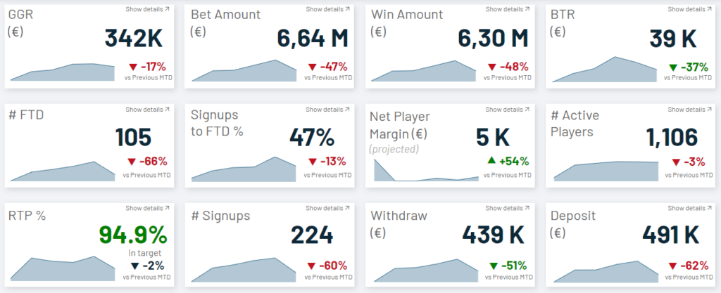
Each KPI indicates what unit of measure is being shown.
Focus management
Each report will contain information of different importance. It is report creator role to help Users focus their attention on the most important parts. It can be done by organizing the page in a specific way or using some accent like color or bold font. It is a standard that most important part of the page is top left

Most important KPI is placed in the top left and catches the attention by inverted colors.
Colors
Using proper coloring helps analyse the data. It is of course hard to use colors everybody like due to personal preferences but pastel colors are usually well adopted. It is recommended to take advantage of color wheels available online and create well balanced color palette. It should contain several easily distinguishable color shades, positive/negative indicators, some neutral color, etc. Usually, colors will be inspired by clients logo colors but it’s important to pay attention to specific ones like red or green that are naturally interpreted which may lead to confusion.
Table with six different colors but still looks good as they are quite faint and in similar saturation helping to quickly find top values without distracting from reading specific cell’s value.
Adoption
Adoption is the process of starting using the report. First impression made is very important as if bad, may result in Users not coming back to the report. What can cause it, is for example:
- Inaccurate data – if Users notice numbers being wrong in an obvious way, it will be very hard to rebuilt their trust. It is not covered in this article as it focuses on reporting standards, not data preparation.
- Unintuitive functionalities – if any button/filter/toggle/etc does not what User expected to happen.
- Ambiguity – when User is not sure what is being shown – for example calculation of a KPI, unit of measure, selections made etc.
- Performance – when the report reactions are very slow. It is not covered in this article as it focuses on reporting standards, not technical performance optimization.
If applied, features of the report listed in this article should help in smooth adoption and result in it being used by the Users which is the ultimate goal of every BI project.
0 Comments